Simplifying Map Search

Background

SpaceIQ is a workplace management platform software, with a patented floor map designer, as a core feature, for space and move management.
I had an opportunity to redesign the floor map experience for a desktop web application. For this case study, I’ll be focusing on the search experience since most of the facility administrators use it as their main entry point, but having issues finding what they are looking for.

Challenge

Helping facility administrators to find and assign employees and spaces.

Goal

We saw this as an opportunity for our users to make search easy, but robust, to help them complete tasks faster.

My Role

I owned and led the entire process including user interviews, UX Research, Interaction Design, User Testing,  Prototypes, and Specifications.

My Team

I worked with a product manager, visual designer, and engineering team.

Timeline

10 weeks, 2019-2020

Outcome

Simple Primary Search

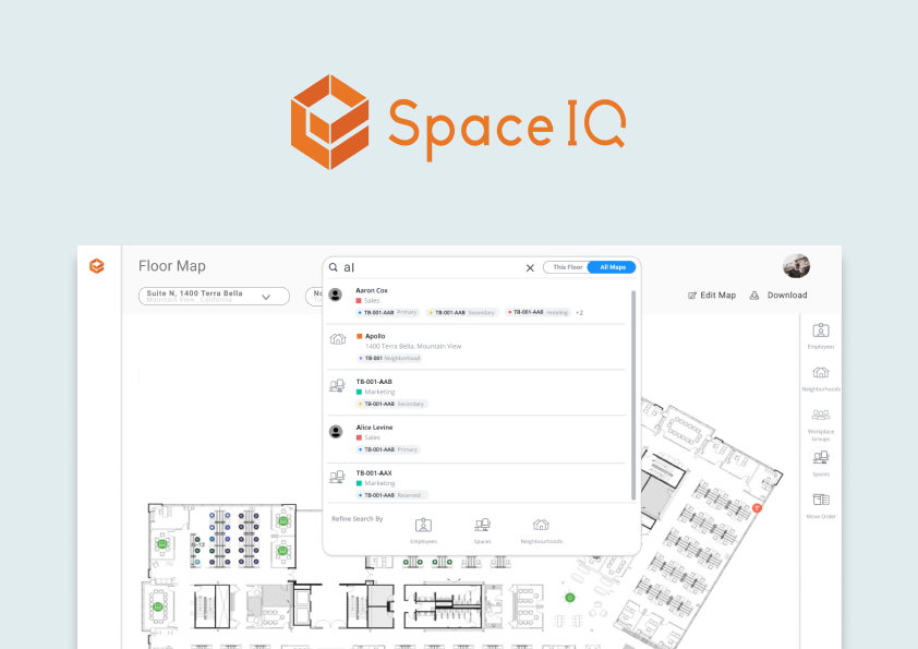
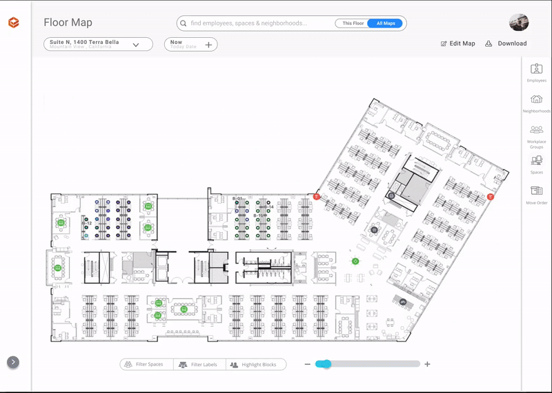
Visible and noticeable scoped search helps users to navigate by recognition and giving them control over the type of information they want to find.

Search results are sorted by best first, visually clear, accessible, and actionable.

Impact

Task Success Rate

Task Completion Time

Net Promoter Rate

Process

From search box to success in no time flat

01

Discover

Why searching isn't intuitive?

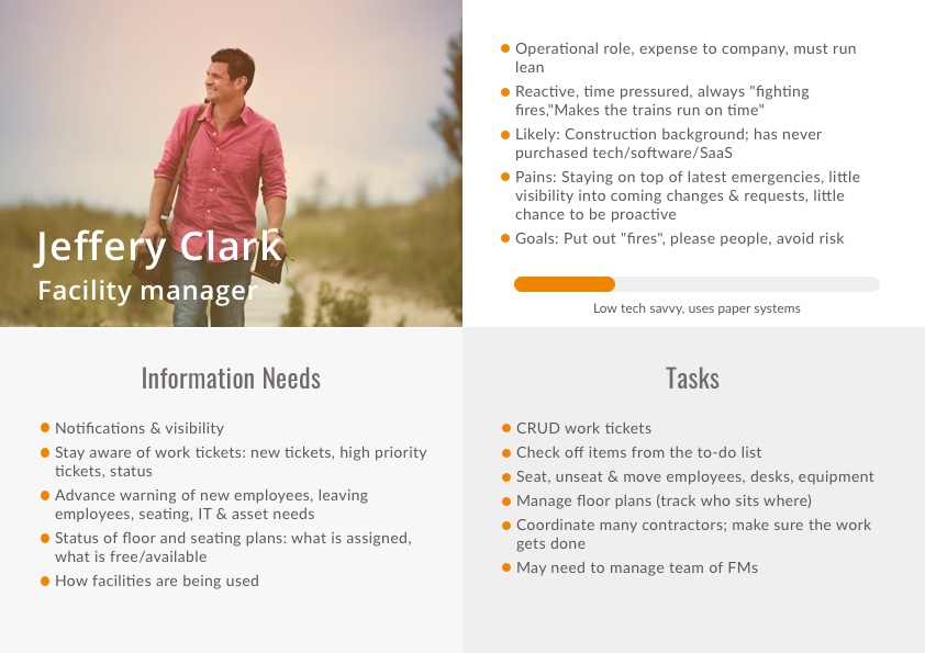
I interviewed customers to gain insight on common flows and pain points, then researched various real-estate and known web applications for commonly used design patterns to help guide design decisions moving forward.

User interviews revealed that search is commonly used but isn't helpful enough

Top Insights

  • Location indication: users are not aware of changing floors when locating
    " I'm not sure if the location is on the same floor or on another one "
  • Filters not useful: users are not aware of existing filters
    " How can I filter the list per department and hire date? "
    " I need to find only meeting rooms, not all other space types "
  • User experience: users get lost with filters and search results flow and interaction
    " How do I assign few employees? "
    " Why I get departments first all the time? "

02

Define

How to simplify search?

User Flows

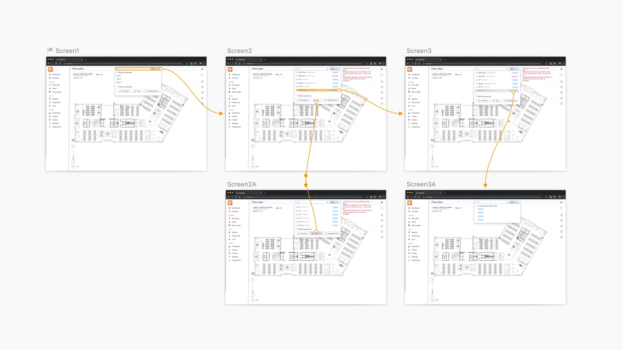
The search is an entry point to two different task flows that require different focus and actions.

Find

  • Employee location
  • Space to set up

Assign

  • Existing employee/s
  • New employee/s

Prioritizing Objectives

Problem
Feature
  • How might we help our users to successfully navigate and complete their tasks in a simple path.
  • How might we improve search results in relevance and focus.
  • How might we improve search results accessibility and recognition for actionable results
  • Recents
  • Categories
  • Filters
  • Sorting by
  • Tags

Success Metrics

  • Percentage of users correctly completed the search
  • Time users completed the search
  • how often users search in a desirable way
  • USers satisfaction score

03

Develop

Test & Iterate

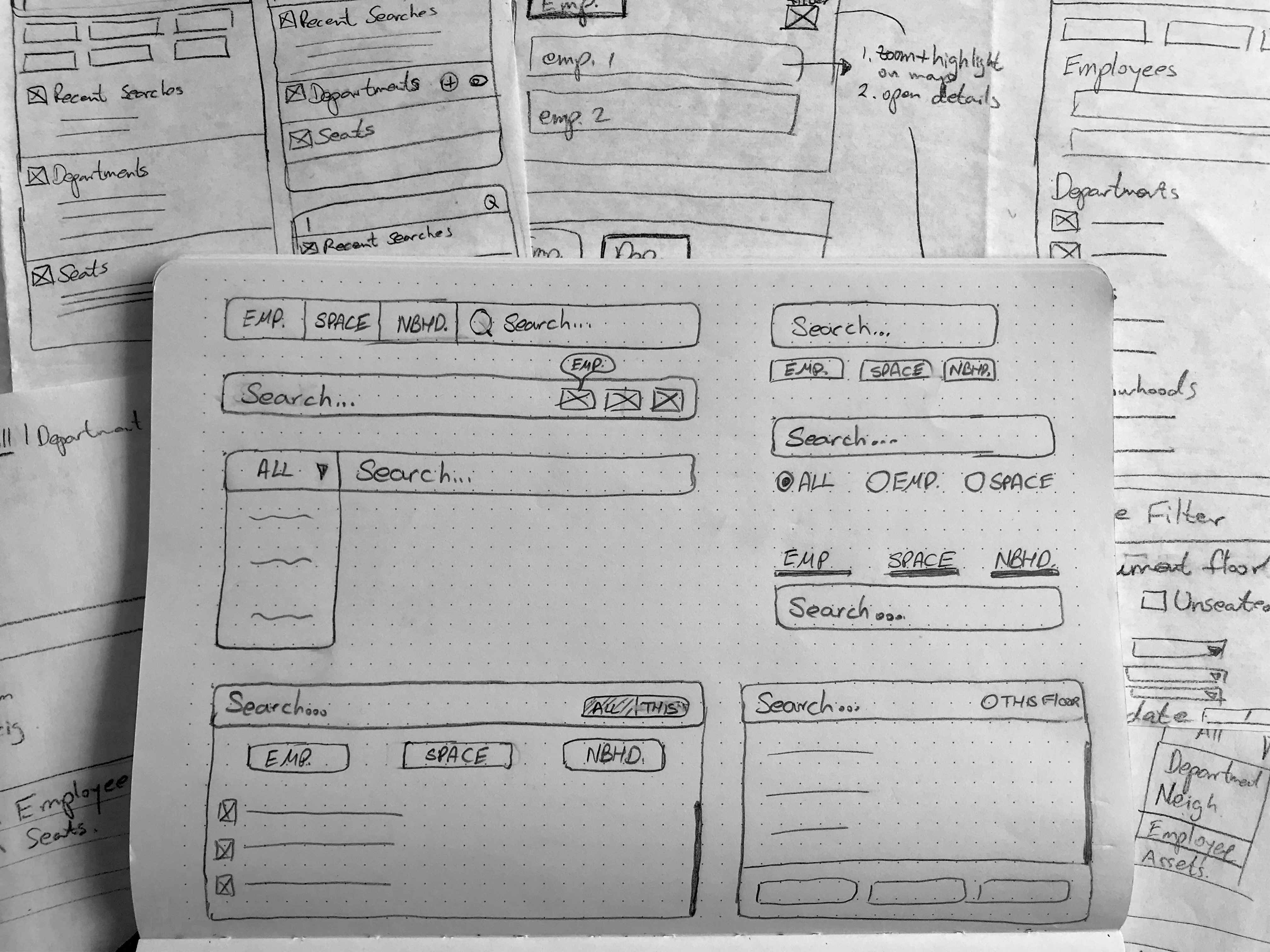
I ideated on different design patterns and flow combinations. I continued to iterate and refine the wireframes while testing the information architecture and flow with users.

One of the main challenges I faced while designing this experience was:
Search is a complex and expensive feature. Technical constraints play a big role in the design.

During iterations, we found that trying to fit all task flows overcomplicates and overloads the user experience.
I found that slimming down functionality (by separating into a new feature) will simplify the flow and will allow a more robust and intuitive experience.

Exploring Filters for Focused Search

Exploring filters that are visible before focus, but might be hidden during search VS. filters that are displayed on focus interaction and actionable during the search.
Using dot voting and user feedback, I decided to go with the subtle approach that is less distracting on a crowded page and more flexible to use.

sketches

04

Deliver

From overcomplicated search to simple experience
sketches

Results

Task Success Rate

Task Completion Time

Net Promoter Rate

Separated functionalities in the redesigned search increased findability and reduced completion time of locating employees and spaces. Also, search is scalable by design to add value with less effort.

Takeaways

I learned that "Less is More" - decoupling capabilities into few flows can help the users to accomplish their tasks and also be much more satisfied.
Also, always ask your users instead of assuming for them - I was proved wrong to assume few users preferences and task flows, that affected the search re-design
And last but not least, since search is a complex and expensive feature, involving the development team from the start (=research phase) is important. The team will understand user needs and help find the optimal solution.