Boosting Employees Productivity by Improving Emotional Wellbeing

Designed 0-1 prototype for desktop web platform including homepage, on-boarding and personalized dashboard.
Context
Workplace productivity and participation is affected by stress and mental wellness in an unhealthy work environment. Training and helping employees how to engage in activities and facilitate intentional incremental change in their wellbeing is important and beneficial to both employers and employees.
Challenge
Impact minds is a Spain-based startup that fills this need by providing approachable mental well-being personalized exercises and activities as a benefit for the employees of participating businesses through an interactive web experience.
Problem
Developing adaptable web interface to best serve both client and customer facing needs as Impact minds' business model requires a B2B appealing landing page (businesses) with an app designed for individual users (employees).
Who:
Business Owner (B2B)
Why:
Communicating the service
What:
Appealing homepage page
Who:
Employee (B2C)
Why:
Improving wellbeing and productivity
What:
Personalized dashboard to practice activities and connect with therapists.
My Individual Contribution
Developing task flows for both the business and employee needs. Ideation on registration, on-boarding and dashboard pages. Iterating on wire-frames, while mainly focusing on the dashboard, and developing high fidelity mockups consistent with branding and style guides.
Results
Interactive desktop web prototype that includes landing pages for businesses, registration, on-boarding and personalized dashboard to track activities for users. Branding, style guides and high fidelity mockups to be implemented by Impact Minds' development team.
Outcome

Personalized Dashboard to empower employees

Personalized dashboard for users to practice activities and connect with therapists.

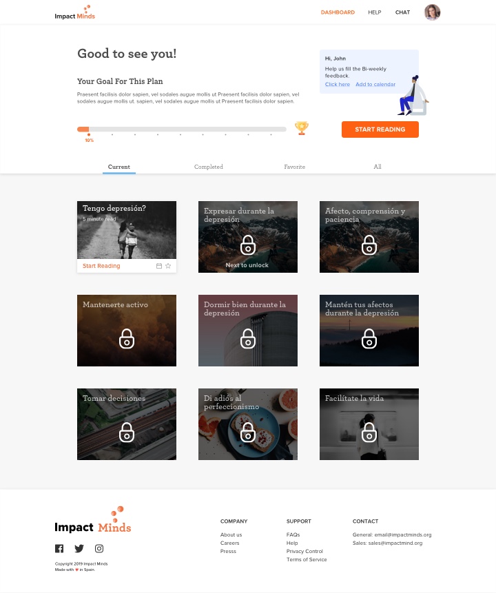
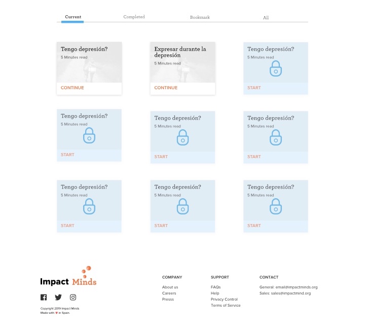
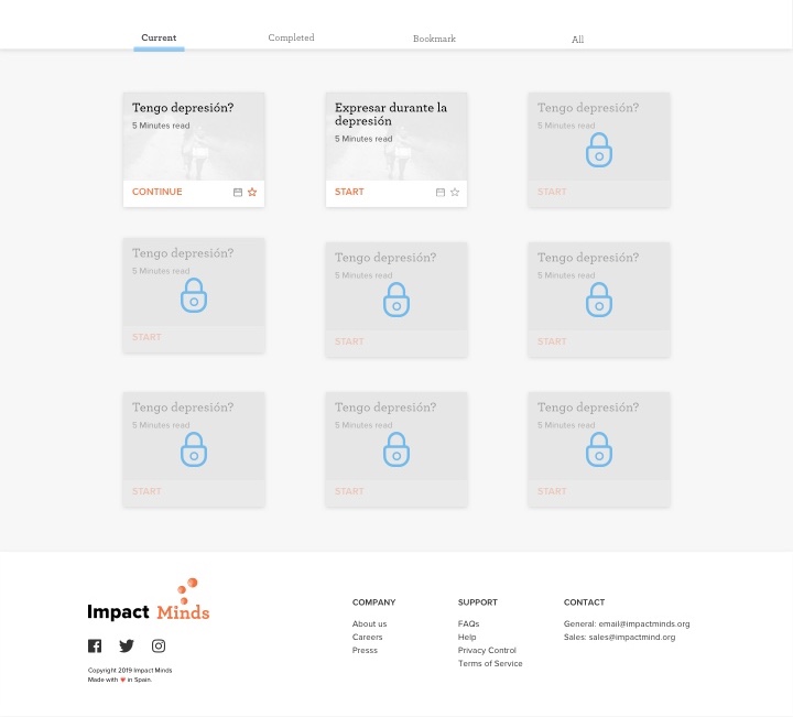
Using gamification like locked activity cards, badges to motivate users and increase engagement and retention.
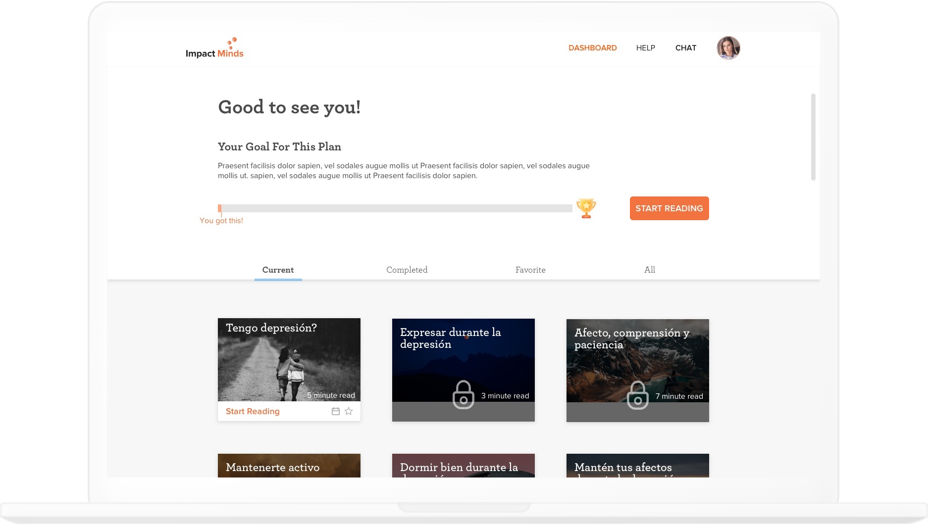
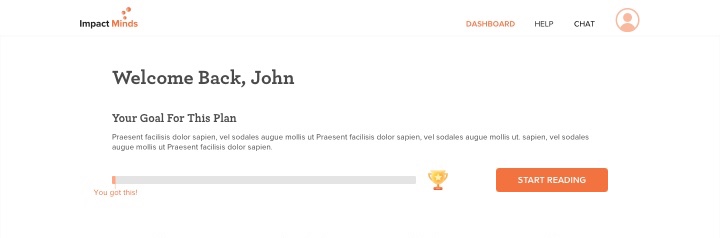
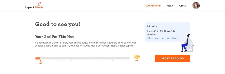
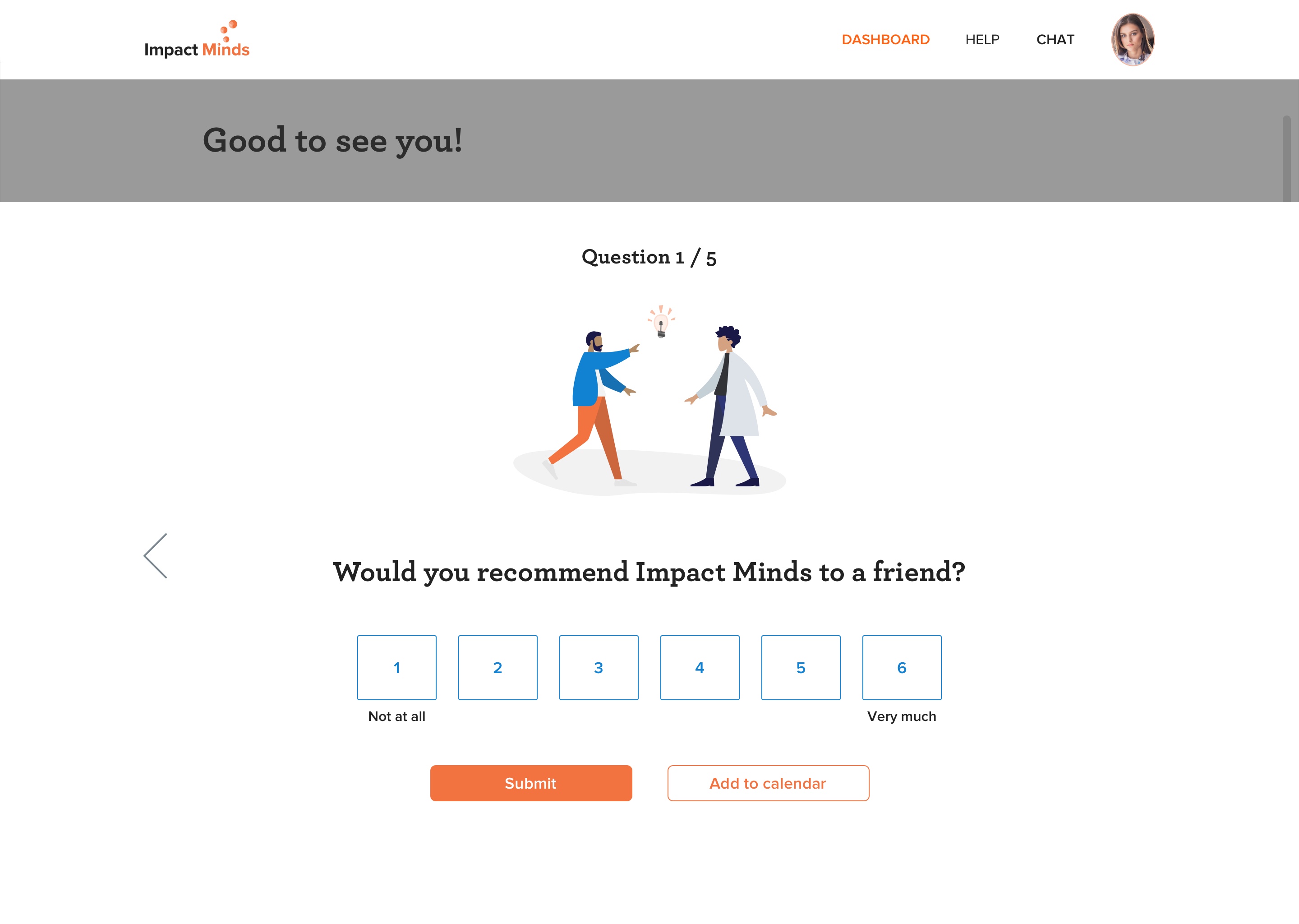
Using personalized plan and and clear goal to build credibility and rapport.

Process

From research, to transformed experience

Discover

How is mental wellbeing being perceived and treated in Spain?

We reviewed various mental health and well-being web experiences to gain insight on commonly used design patterns, color themes and strategies to help guide design decisions moving forward

Users interviews with 15 people revealed that mental health is often stigmatized, so credibility is crucial to gain trust and habit is important to retention rates.

Top Insights:

01.

Credibility

Is necessary to sell to businesses and to gain trust with users.

02.

Rapport

Build rapport so users will engage more with the platform. Users will be more willing if there is rapport with their business.

03.

Habbit Forming

Changing habits is hard, so users need habit forming platform to create new habits.

Define

Destigmatizing Mental Well-being

Problem
Proposed Solution
Posible Features

Credibility

  • Using on-boarding for new users to explain about the plans and progress.
  • Using success metrics to show proof of value.
  • Progress bar
  • New user walkthrough

Rapport

  • New user sign-up flow uses assessment questioner with conversational and personal copy, friendly tone, one question at a time not to overwhelm first time user.
  • Feedback Form
  • Chat

Habit Forming

  • Using gamification pattern to encourage the users to interact more with the web app, like adding game elements so the users can be challenged to check-in frequently during a week and be rewarded if they do so. Since people like having a clear goal and even more to be rewarded after its achieved, such a challenge would doubtfully pass unnoticed among the users.
  • Badges
  • Locked activities
  • Favorites
Task Flow

With a clearer understanding of existing design patterns and our users, we iterated on user tasks and developed a task flow to help us define the information architecture and needed screens.

The main challenges I faced while designing this experience were:

  • Information architecture - how should I present information in a way that accommodates the 2 different use cases: businesses and users (employees)?
  • Flow - how can I insure sense of credibility and privacy considerations for both businesses and users?
Develop

Test & Iterate

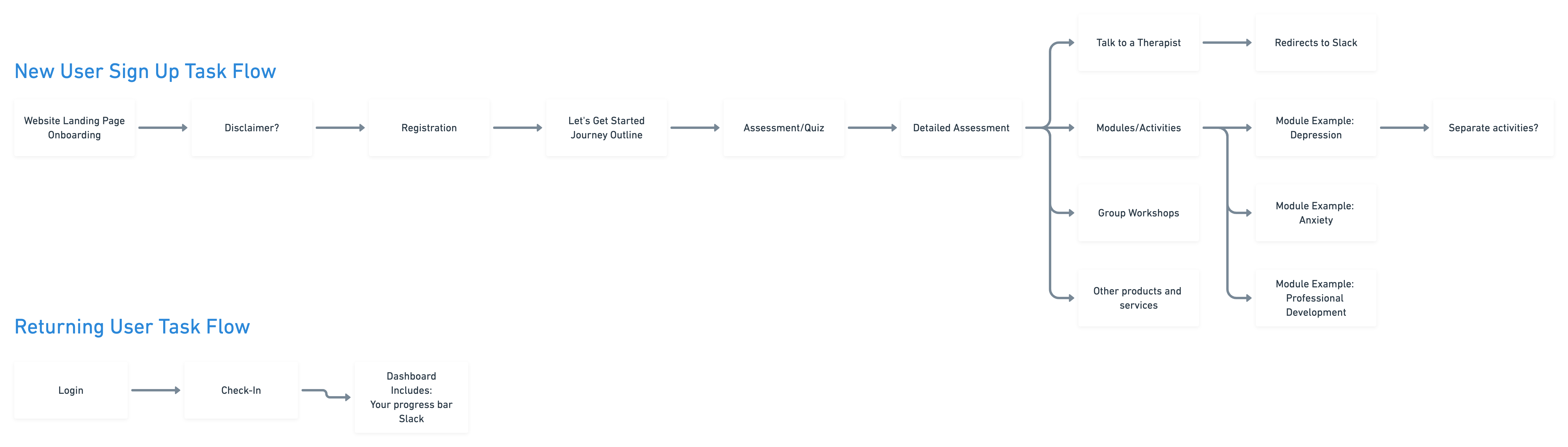
With a framework in hand, we broke off into sub-teams to design different parts of the product. From then on, I owned the process of designing the dashboard pages for users.

I created sketches to sample different layout and features combinations. I continued to iterate and refine the wireframes while testing the information architecture and flow with users.

The main challenges I faced while designing this experience were:
Tone and feel: How the copy can convey credibility and welcoming feeling?
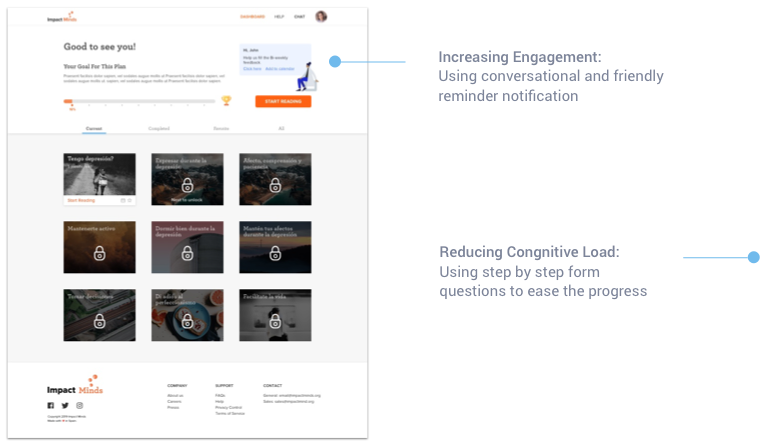
Engagement: How should I engage the users to complete the tasks and come back frequently? How can I establish sense of progress?

Exploring Dashboard Layout

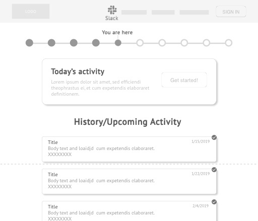
Left side navigation bar - simple and responsive, but confusing when combined with top navigation.
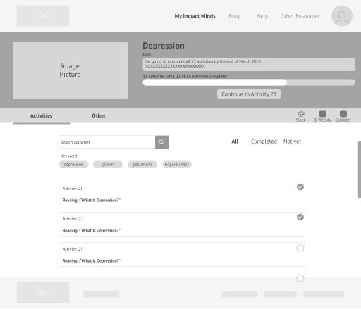
Activities List View - intuitive, but too clinical and cluttered.

Activities Tree View - condensed, but too complicated to engage.

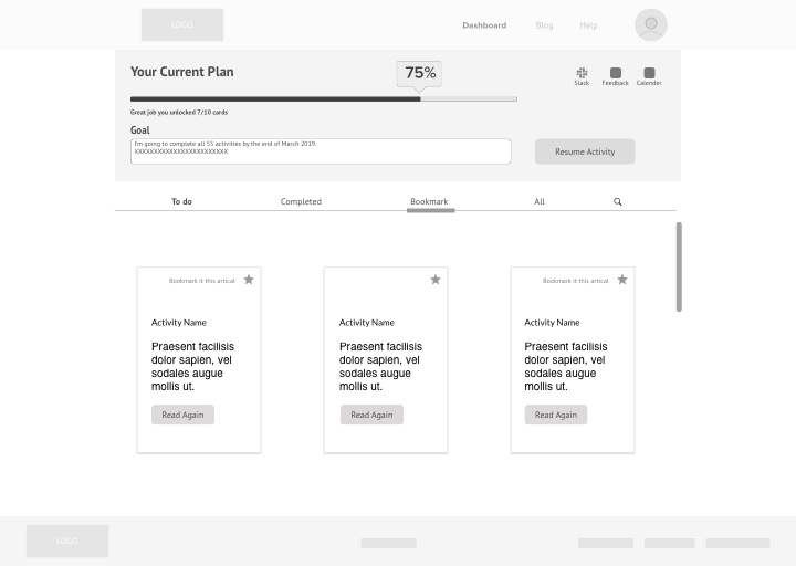
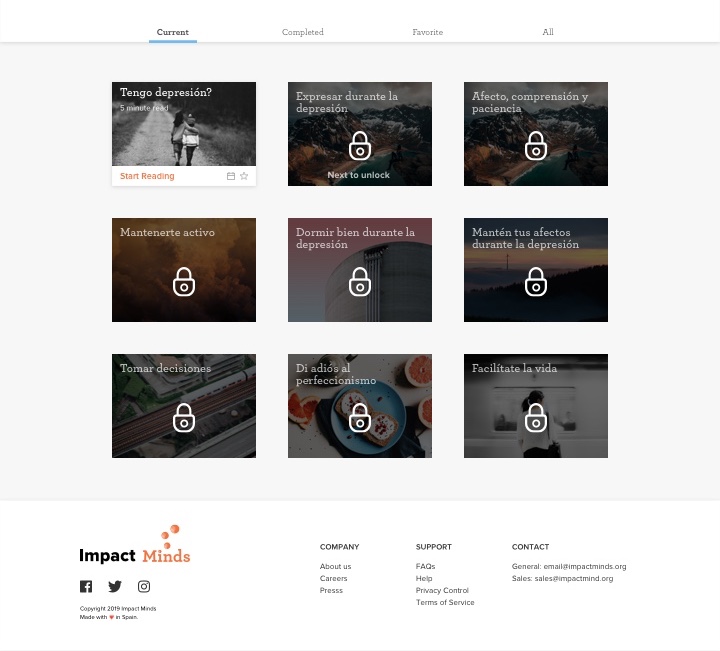
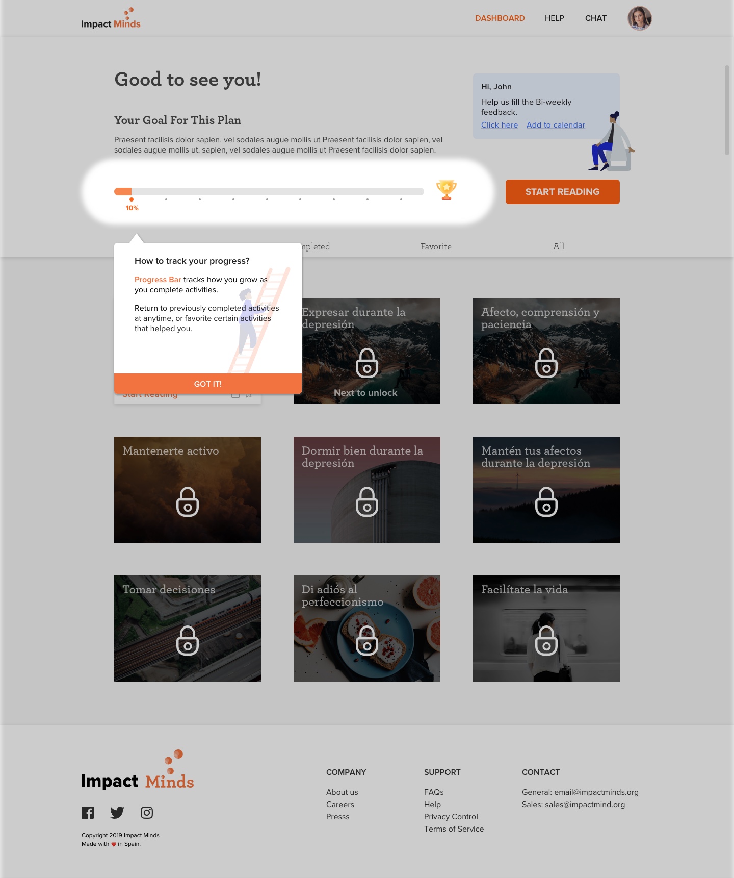
Progress Bar - to track progress helps to prove value.
Main Activity CTA
- at the top is clear and engaging.

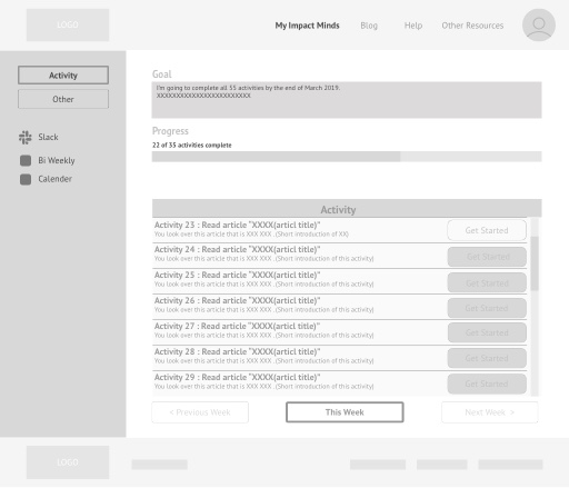
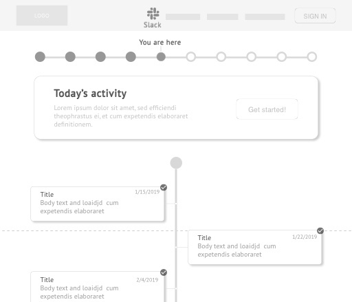
Activities Cards View - less cluttered and more friendly to users.
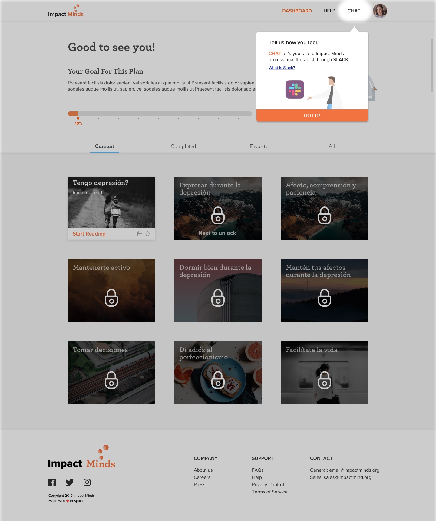
Chat (Slack) Link
- moved to top navigation is accessible whenever user is logged-in.

Personalized Goal - is friendly and motivating.
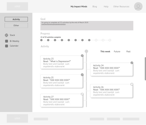
Gradual Reveal
- grouping key insights on the top

Activities Cards Grid Layout - easier to scan and not overwhelming.
Favorite Activities
- personalized the experience and increases engagement.

Iterating on Progress bar Feature

DOtted Progress BAr
Using progress bar to encourage strong sense of momentum.
Adding BAdge
Adding trophy icon badge to encourage sense of achievement.
Final Version
Refining with adding completed percentage for clear sense of progress.

Iterating on Activities Card Feature

Adding Locked Cards
Using gamification pattern to challenge and encourage the users to interact more frequently.
Adding Favorite & REminder
Adding favorite to personalize experience, and reminder to increase engagement.
Final Version
Refined version with clear CTA copy
Deliver

From Multiple Iterations, to One Engaging Dashboard Experience

Returning User Dashboard
First Time User Dashboard Walkthrough

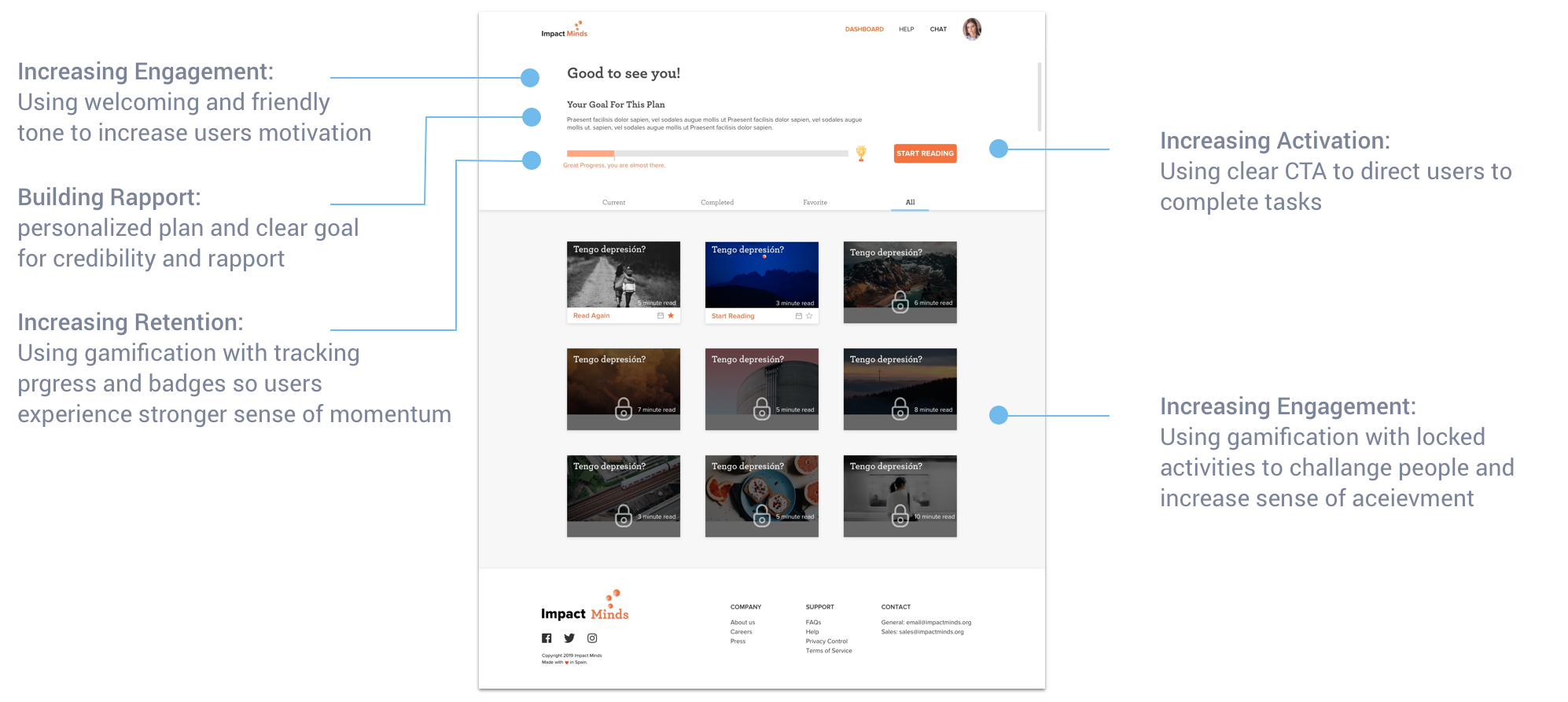
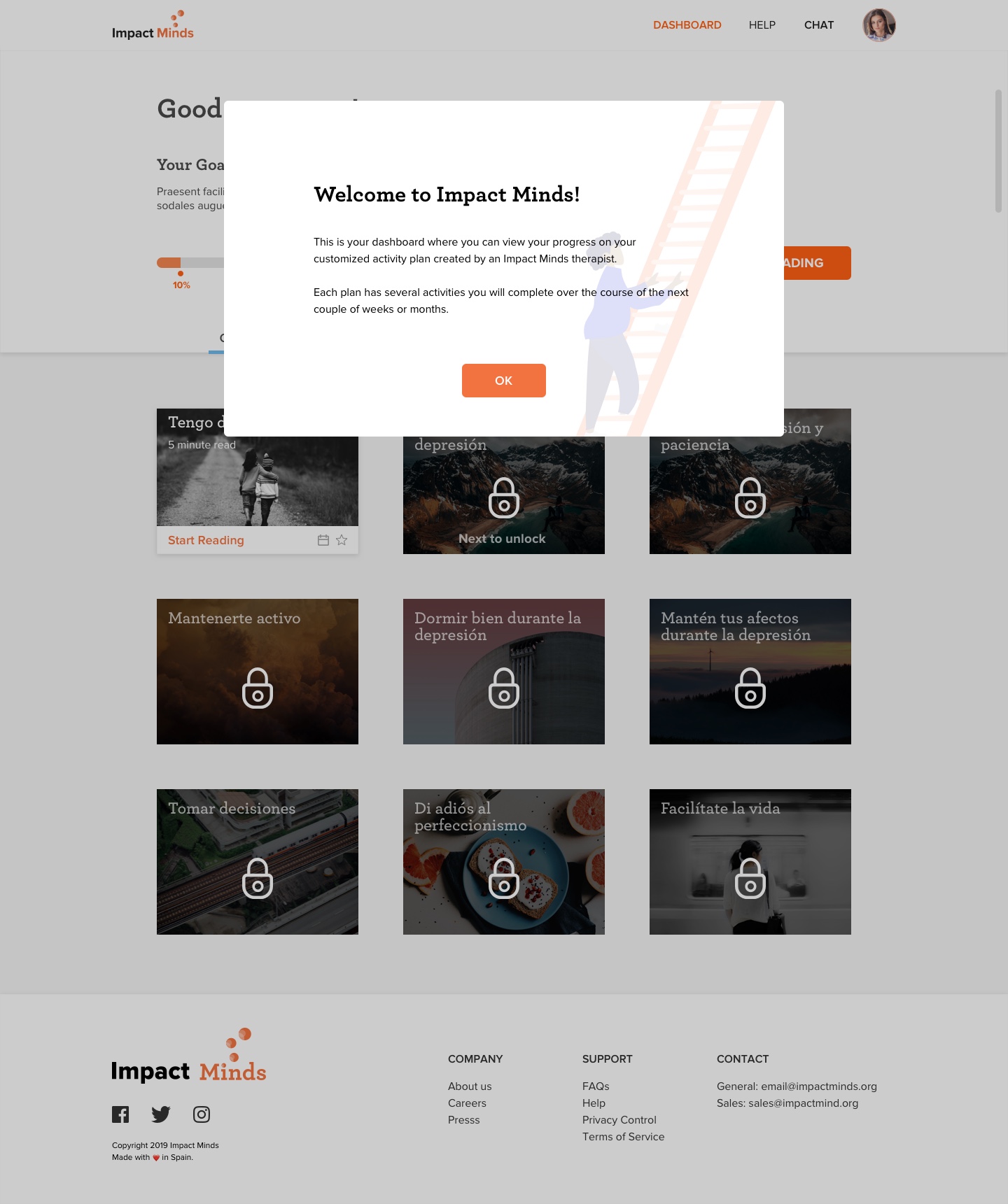
Increasing Adoption:
Using coach marks to expose the app's workflow
and familiarize the users with the different features increases comfort and credibility.

Activity Modal on Dashboard

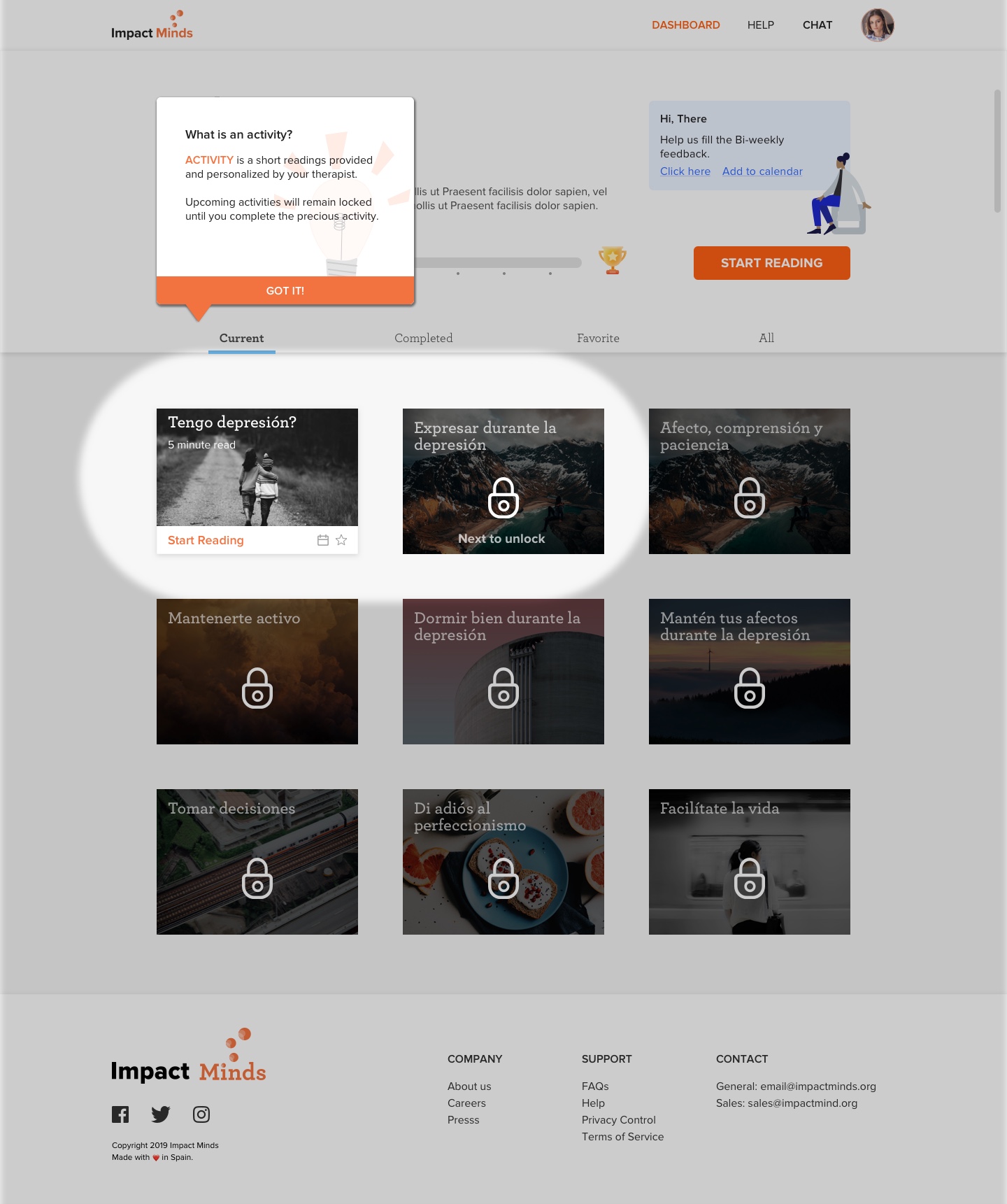
Increasing User Experience:
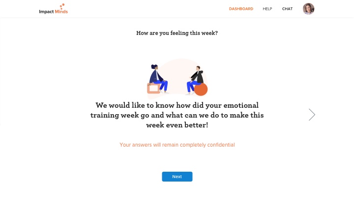
Using subtle interactions to help guide the user
with the process and flow.

Bi-Weekly Feedback Form On Dashboard

Takeaways

Designing a 0-1 web application consists of many iterations for layout, features and copy to satisfy both business and users and to create a user experience that is engaging and motivation to increase user adoption retention.